Hi guys! im curious if anyone has identified the fonts used for the game, I recognise the logo font but cant for the fuck of me work out exactly what it is! I know the game cards use RaphaelStd for the back text, but cant work out what the front text titles are (time, fate etc.)
any takers?
Cheers
BRAD
Fonts!
2 posts
• Page 1 of 1

Re: Fonts!
![]() by marr0w » Sun Aug 23, 2015 6:37 pm
by marr0w » Sun Aug 23, 2015 6:37 pm
Lemme just dig this thread out of the grave since I just found some old notes. As some of you may remember I used to try and troll people on April Fools Day in various ways including fake advertising for non-existent games so I got pretty good at getting the logos close.
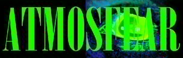
The font for the Atmosfear 'the Harbingers' logo is Bodoni MT Poster Compressed
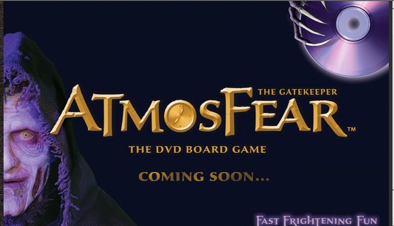
The font for Atmosfear 'the Gatekeeper' is ALMOST Tempus Sans ITC with the 'capital' letters a font size larger.
Tempus Sans ITC is also what I used for the Well of Fears logos on the site.

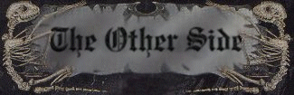
My old 'The Other Side' website used Creepygirl and Nosfer - which closely resembles some of the packaging fonts. The closest I can find to the NIGHTMARE logo font is Old English Text MT which is nearly perfect for lowercase letters save for an extra line in the a. The capital letters not as much, but I don't think anyone would notice the difference unless you were typing "Nightmare" and put it side by side with the original logo.
 - Old English Text MT example
 - Creepygirl example
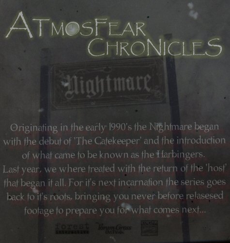
For my fake Atmosfear Chronicles logo I used Papyrus, changing font size for the larger letters, and inserted the clock from the first DVD game in the 'O'. Text below the logo is using the Nosfer font.
The font for the Atmosfear 'the Harbingers' logo is Bodoni MT Poster Compressed
The font for Atmosfear 'the Gatekeeper' is ALMOST Tempus Sans ITC with the 'capital' letters a font size larger.
Tempus Sans ITC is also what I used for the Well of Fears logos on the site.
My old 'The Other Side' website used Creepygirl and Nosfer - which closely resembles some of the packaging fonts. The closest I can find to the NIGHTMARE logo font is Old English Text MT which is nearly perfect for lowercase letters save for an extra line in the a. The capital letters not as much, but I don't think anyone would notice the difference unless you were typing "Nightmare" and put it side by side with the original logo.
- Old English Text MT exampleFor my fake Atmosfear Chronicles logo I used Papyrus, changing font size for the larger letters, and inserted the clock from the first DVD game in the 'O'. Text below the logo is using the Nosfer font.
"...boredom, a dangerous and deadly tool..."

-

marr0w - Hosts

- Posts: 171
- Joined: Tue Jul 27, 2010 12:48 pm
- Location: Atlanta, GA
2 posts
• Page 1 of 1
Return to Original Series (VHS Era)
Who is online
Users browsing this forum: No registered users and 5 guests